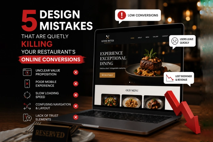
5 Design Mistakes That Are Quietly Killing Your Restaurant’s Online Conversions
Your restaurant might have the best chef in the city and a stunning interior, but if your digital front door is broken, THEN many potential guests will never taste your food. Diners now make split-second decisions to enter a place. If they encounter friction on your site, they don't just get annoyed, they leave and order from your competitor. This is called the silent killer.
As a specialized restaurant website design agency, we are seeing the same thing over and over again, which are not obvious bugs, but are subtle design flaws that drain your revenue by frustrating hungry users. So, here are the five most common design mistakes that are quietly killing your conversions.
This is the most frequent mistake in the industry where many owners upload a PDF of their print menu because it’s easy. However, for a mobile user, browsing a PDF is a conversion nightmare.
The Problem - A PDF needs to be downloaded, which uses data and time. Once opened, the user then has to pinch and zoom to read the font. If they want to see the drinks, they have to scroll through six pages of appetizers.
The Fix - A restaurant web design agency should build a live, responsive menu. This is where a web-based menu adapts to screen size, allows for easy category switching, and is indexed by search engines. If you aren't using a live menu, then you are invisible to anyone searching for specific dishes like the truffle Risotto near me.
When a user lands on a restaurant site, they are usually looking for three specific things, The Menu, The Location, and The Booking/Ordering Button. If your design buries these under a creative landing page or a long our story video, then you are losing sales.
The Cognitive Load - A hungry brain has low patience. If the order now button isn't visible within the first two seconds, then the bounce rate skyrockets.
The Fix - Use a sticky navigation or a clear Hero Section which keeps these three links accessible at all times. The best designs today are to use a floating Action Button on mobile that follows the user as they scroll.
Diners in 2026 rarely trust what a restaurant says about itself. They trust what other diners say. For example, a common mistake is to have testimonials page that hasn't been updated in years, or worse, no reviews at all.
The Trust Gap - If a user has to leave your site to check Yelp or Google Reviews, then there is a high chance that they won't come back. They might see an ad for another restaurant on that third-party app.
The Fix – You need to integrate live review widgets. A professional restaurant website development agency will embed a feed that pulls in your latest 5-star Google or Open Table reviews directly onto your homepage to create immediate trust.
We eat with our eyes first. By using some generic stock photos of a burger or low-light, blurry photos that have been taken on an old phone actually decreases a person’s appetite.
The Visual Disconnect - If the photo on the website looks like a fast-food advertisement, but your prices are fine-dining, the customer then feels a sense of Brand Dissonance.
The Fix - You need to have professional, high-fidelity photography. This is an investment. Here, we are seeing a shift toward short-form video that loops showing steam rising from a steak, which increases engagement by up to 300%.
In the sensory-driven world of hospitality, your website's imagery serves as a digital appetizer. If you use generic stock photos or amateur, then the low light snapshots will do more than just providing you a look cheap, which actively triggers a psychological rejection in the hungry brain. This creates a catastrophic Visual Disconnect, when a diner sees a plastic stock photo, but is expected to pay fine dining prices, experiencing Brand Dissonance. Their subconscious tells them the experience is a scam, or at the very least, inconsistent, which leads them to close the tab immediately.
To solve this, the professional focuses on providing crave ability, which means having high fidelity, custom photography. However, the 2026 standard has moved beyond static images into the realm of Cinemagraphs and short-form video loops. Therefore, by integrating high-definition, micro-moment videos, a knife pierces a molten chocolate cake or the subtle shimmer of steam that rises from a fresh steak you will engage the viewer's mirror neurons.
This sensory simulation makes the viewer feel like the food that is already in front of them. Statistics show that these motion based visuals increase time on site by 40% and boost engagement by up to 300% compared to traditional photos. If your food doesn’t move on the screen, then your brand will feel stagnant in the mind of the consumer.
You’ve convinced the visitors to order from your site. But then, you also need to ask them to create an Account or fill out a 12 field form just to pay. This is where 70% of restaurant orders are lost.
The Abandonment Trap - Every extra click is an opportunity for the customer to change their mind.
The Fix - Have the guest checkout and digital wallet integrated into the system like Apple Pay/Google Pay. A specialized agency ensures the checkout flow is a straight line.
In the high speed digital economy, the checkout phase is the most fragile part of the customer journey. For example, when a hungry diner reaches your payment page, then they are operating on biological time, their patience is at an all-time low.
If you are forcing a guest to create an account or verifying an email address before they can buy a sandwich is a retail relic that acts as a digital brick wall. Also, data shows that forced registration is the number one reason for cart abandonment, as it triggers the Abandonment Trap. Here, the more mental energy a user spends on a form, the more time they will have to reconsider the cost or the calories.
A web design agency India fixes this by implementing a zero-friction strategy that starts with Guest Checkout, allowing users to complete an order using only their phone number or email. To take it further, the integration of Digital Wallets like Apple Pay, Google Pay, or even one-tap browser saves (like shop pay) will transforms a 12 field manual entry into a two second biometric scan. Therefore, by removing the need to find a physical credit card and type in long digits, you create a straight-line flow. In the present time, the goal is to move from hungry to confirm in three clicks or less.
The design mistakes aren't just killing your sales, but they could lead you to legal trouble. A massive mistake is that many owners ignore ADA (Americans with Disabilities Act) compliance.
If a visually impaired diner cannot navigate your menu using a screen reader because your images lack Alt-Text in it, then your restaurant is vulnerable to lawsuits. A reputable agency builds with WCAG 2.2 standards. They build a platform that is inclusive to a segment of the population with massive spending power.
Don’t let subtle design flaws drain your revenue and drive hungry customers into the arms of your competitors. Your website should be your most profitable location, working tirelessly to convert clicks into cravings. Fix your design mistakes now and transform your digital presence into a high-performance engine for long-term hospitality success. FODDU will help you with your goals. Get in touch with us at the earliest.

 1.svg)