Mobile-First vs. Mobile-Responsive - What Restaurant Owners Need to Know
In the fast-paced dining world, a restaurant's digital presence is often the first bite that a customer takes before really dining in the spot. Most owners understand that they need a site that works on a phone, but there is a massive technical and psychological difference between a site that is merely mobile-responsive and one that is built mobile-first.
If you are consulting with a restaurant Website Design Agency, then the choice between these two approaches will determine whether your customers enjoy a good ordering experience or abandon their cart in frustration. Let’s dive into this post to understand that why this distinction is the secret ingredient to your digital success.
To the untrained eye, both the mobile first and mobile responsive sites might look fine on a smartphone. However, the engineering behind them is fundamentally different.
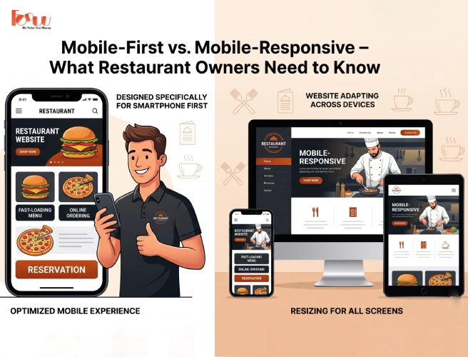
Mobile-responsive design is a top-down approach in which the agency builds a beautiful desktop website first, then uses a code to shrink and stack elements, so that they fit on smaller screens.
The Downside – The results lead to bloated version. Because the mobile version is just a squished version of the desktop site that loads heavy assets that a phone doesn't need, leading to slower speeds.
Mobile-first is a bottom-up philosophy in which the restaurant Website Design Agency starts by designing the experience for the smallest screen like the smartphone and then adds features as the screen size gets larger.
The Upside – The site prioritizes the most important actions like booking a table or Order now, ensuring that they are the easiest buttons to click.
In 2026, the consumer behaviour for diners has shifted as people searching for a restaurant on their phone that has a usually high-intent and low-patience.
Most mobile users are now searching while on the move. They don't want to read a long About Us section, rather they want the address, the phone number, and a button to see the menu.
A specialized restaurant Website Design Agency knows that most people use their phones with one hand. Mobile first design places critical buttons (Order/Call) within the Natural Thumb Zone at the bottom of the screen, rather than hidden in a tiny menu at the top.
When you choose a mobile-first approach, then it isn't just about looks, but about the performance and profitability.
Google now uses Mobile-First Indexing, which means that Google’s bots look at a mobile site before the desktop site to decide the search rank. This means that mobile-first sites are lighter and faster. In an industry where a 1 second delay can lead to a 7% drop in conversions, then the speed is money.
A mobile-responsive site might have a menu that is a PDF link. For example, a user on a 5G connection, downloading a 10MB PDF, then it is a nightmare for him. On the other hand, a mobile-first site uses dynamic menus that load instantly and allow users to add items to a cart without ever leaving the page.
The numbers for 2026 show a clear winner in the mobile debate
Over 82% of all restaurant related traffic now originates from mobile devices. If your site isn't optimized for these users first, then you are ignoring the vast majority of your customers.
Mobile-responsive sites that lag during the stacking process see a bounce rate (people leaving immediately) that is 35% higher than native mobile first designs.
Further, frictionless mobile-first ordering systems see an average increase of 15% in order value simply because the add-ons and sides are easier to navigate on a touch screen.
When a customer is hungry, their cognitive load capacity drops. They become easily frustrated by small text or hard to click buttons. An expert restaurant website design agency uses mobile-first principles to cater to this hungry brain:
Simplified Navigation - Instead of having a complex menu bar, mobile-first sites use hamburger menus style or simple icon-based navigation.
Visual Hierarchy - High-resolution images of food are the hero. So, in the mobile-first, the image is optimized to pop even on a low-brightness screen.
One-Tap Everything - Whether it's Google Maps integration for directions or Apple Pay for checkout, everything is one tap away.
If you are currently looking for a restaurant website design agency, then ask them these three questions to see if they truly understand the mobile-first revolution:
Do you design the smartphone layout before the desktop layout?
The answer must be YES.
How do you handle the menu on mobile?
The answer should be Interactive/Dynamic, never PDF.
What is your target LCP (Largest Contentful Paint) for mobile?
A pro agency will aim for under 2.5 seconds.
The next step beyond mobile-first is the Progressive Web App (PWA). In this process, many top-tier agencies are now building restaurant websites that behave like apps.
Offline Access - Customers can view your menu even if their signal drops in a subway.
Push Notifications - You can send a notification about a Happy Hour special directly to a customer's phone if they’ve saved your site to their home screen.
No App Store Needed - Users get the app experience without the hassle of downloading anything from an App Store.
Don't Let Your Website Be a Barrier
Your website should be an open door, and not a locked gate. While mobile-responsive design was a great step forward ten years ago, the Mobile first approach is the only way to stay competitive in 2026. Mobile website respects the customer's time, caters to their physical habits, and satisfies the algorithms that determine your visibility.
So, when you hire a restaurant website design agency, then don't settle for a site that just works on a phone. Demand for a site that was born for the phone.
Build a Mobile-First Masterpiece
At Foundation of Design Uprising Unit (FODDU), we don't believe in shrinking your vision. We believe in building high performance, mobile first websites that are designed to handle the high-pressure world of hospitality. As a specialized restaurant website development agency, we ensure your digital dining room is fast, intuitive, and built to convert hungry visitors into loyal diners.
Therefore, stop losing customers to slow, clunky sites. Get in touch and have a mobile-first experience that leaves your competition in the rear view mirror.